With Thanksgiving just a day away, it is officially the holiday season which = parties galore. I love this time of year when everyone puts down their normal routine for awhile and makes a special effort to spend time with their loved ones.
I made an invitation for our Friendsgiving feast last weekend and had so much fun doing it I decided to create a few more. I recently stumbled on a site called PicMonkey which is not only (mostly) free, but very user-friendly. I sprang for their 'premium' service which gives me access to some of their more advanced graphics and fonts because for the price of $5/mo - or $3/mo if you buy a whole year at a time - I figured it would be worth it.
I've had a lingering cold all week so on
Below are the four invites I created ready for your customization by following these steps:
1) Right-click on the invite you want below and select 'Save Image As' on your computer.
2) Go to picmonkey.com and select 'Edit a Photo' from the banner at the top of the screen and choose the saved invite from your computer.
3) To add text, select the text icon from left-hand menu, pick the font you want, and then press 'add text'.
4) From here you can change the size, color, and position of your text to fit the invitation. Under the invitation below I've listed the font type and html code for the color I used in my examples if you want to copy those. Using the html code is the easiest way to get a specific color and can easily be changed here (this box will pop up when you select 'add text')

5) Once you have all your information in & positioned correctly, save it to your computer and you're done!
Cheers

Font: Quicksand
Color: 544a43
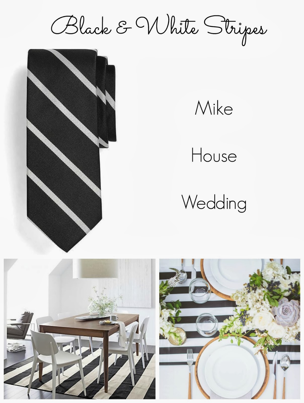
Candy Cane

Color: 000000 (black) / ffffff (white)
2014

Font: Geo Sans Light / Learning Curve
Color: 000000
Art Deco

Font: Quicksand
Color: d38e00